Taylor Community Library IA

Category
Information Architecture
Client
Kent State University
Role
Lead Designer
The Challenge
Taylor Community Library's website had grown the way most institutional sites do: one addition at a time, with no one ever stepping back to ask whether the whole site still made sense.
The result was an information architecture that worked for the people who built it and no one else. My job was to rebuild that structure from the ground up, so that a parent looking for the library's hours and a student searching for homework help could each find what they needed without having to think like a librarian to do it.
Research & Discovery
The new updates to website needed to be backed by data and feedback directly from people using the site.
I approached the research in four parts (interviews, a literature review, user personas, and a task-prioritization exercise) because I didn't want the new architecture to rest on assumptions about what patrons needed. It needed to rest on evidence.
Interviews
I interviewed two librarians at Old Worthington Library in Worthington, Ohio: Chris, a 40-year veteran of the profession, and Lauren, 26 years in. I went to librarians first because they sit at the reference desk every day, fielding the same questions over and over. They had more pattern-recognition on real patron behavior than any survey could give me. From those conversations, a clear picture emerged: site visitors split into two dominant groups, high school students and parents, moving between desktop and mobile depending on where they were. Regardless of group, the same handful of tasks came up again and again:
Viewing library hours, location, and closing information
Checking whether a book was in stock
Browsing library events
Applying for a library card
Finding homework help
Locating digital resources
Managing an account or paying a fine
Tracking down the library's social media
Just as important as what people were looking for was how they were looking for it. It was clear that search wasn't a secondary feature, it was the primary way people navigated the site, which meant it had to be placed somewhere impossible to miss.
Literature Review
I then turned to the literature to see whether the field's research backed up what I'd heard firsthand. It did, consistently. Gambrell (2015) confirms that search is the primary action a user takes on a library website, reinforcing that the search box belongs prominently on the homepage rather than tucked into a menu. Duncan and Holliday (2008) found that patrons are just as focused on practical building information (hours, location, directions, closures) as library staff assume they are, and that circulation tasks like checking availability and renewing books are close behind. One finding shaped my approach to labeling directly: Silvas, Theo, and Koos found that patrons are frequently confused by library-specific jargon, and recommend using the plain, everyday language a visitor already knows instead of internal terminology. That became a standing rule for every label in the new IA.
User Personas
With the interview findings and literature review in hand, I built user personas to keep the two dominant patron groups, students and parents, concrete and specific throughout the design process, rather than letting "the user" stay an abstraction.
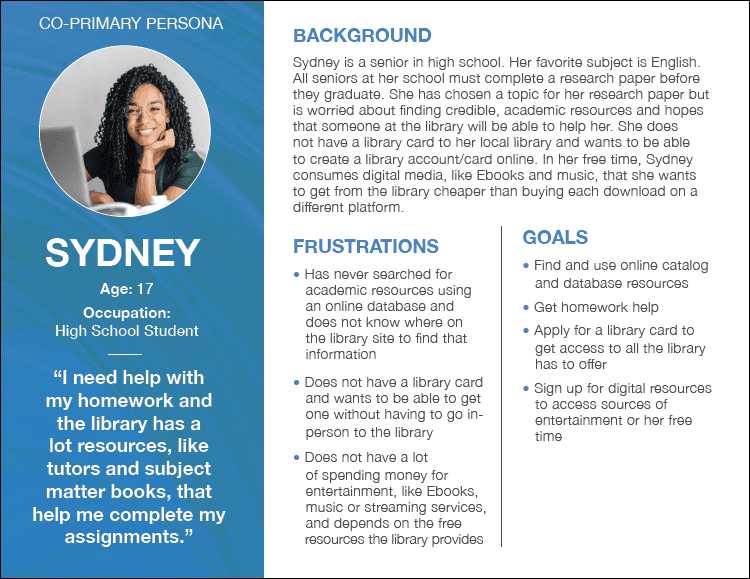 | 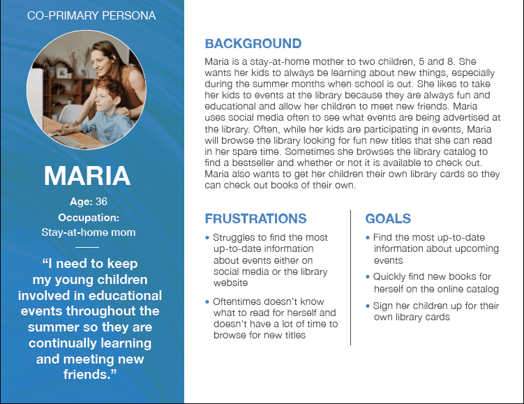 |
Task Prioritization Exercise
From there, I built a task-prioritization chart, mapping each key task against the persona most likely to need it and ranking its importance to the overall architecture. That chart became the backbone for every structural decision that followed: it's the difference between an IA organized around how the library thinks about its own collection and one organized around what a visitor actually came to do.
Task | Persona A | Persona B |
|---|---|---|
High Priority Tasks | ||
Find library hours and location | ✓ | ✓ |
Find book availability | ✓ | ✓ |
Apply for a library card /apply for an account | ✓ | |
Browse catalog | ✓ | ✓ |
Find upcoming events | ✓ | |
Medium Priority Tasks | ||
Get homework help | ✓ | |
Access digital resources (download eBooks, Music, etc.) | ✓ | ✓ |
Low Priority Tasks | ||
Access social media accounts | ✓ | |
Pay fines | ✓ | ✓ |
Final Deliverables
Ideas tested again and again with real people, are what turn a deliverable into something with actual meaning.
Sitemap
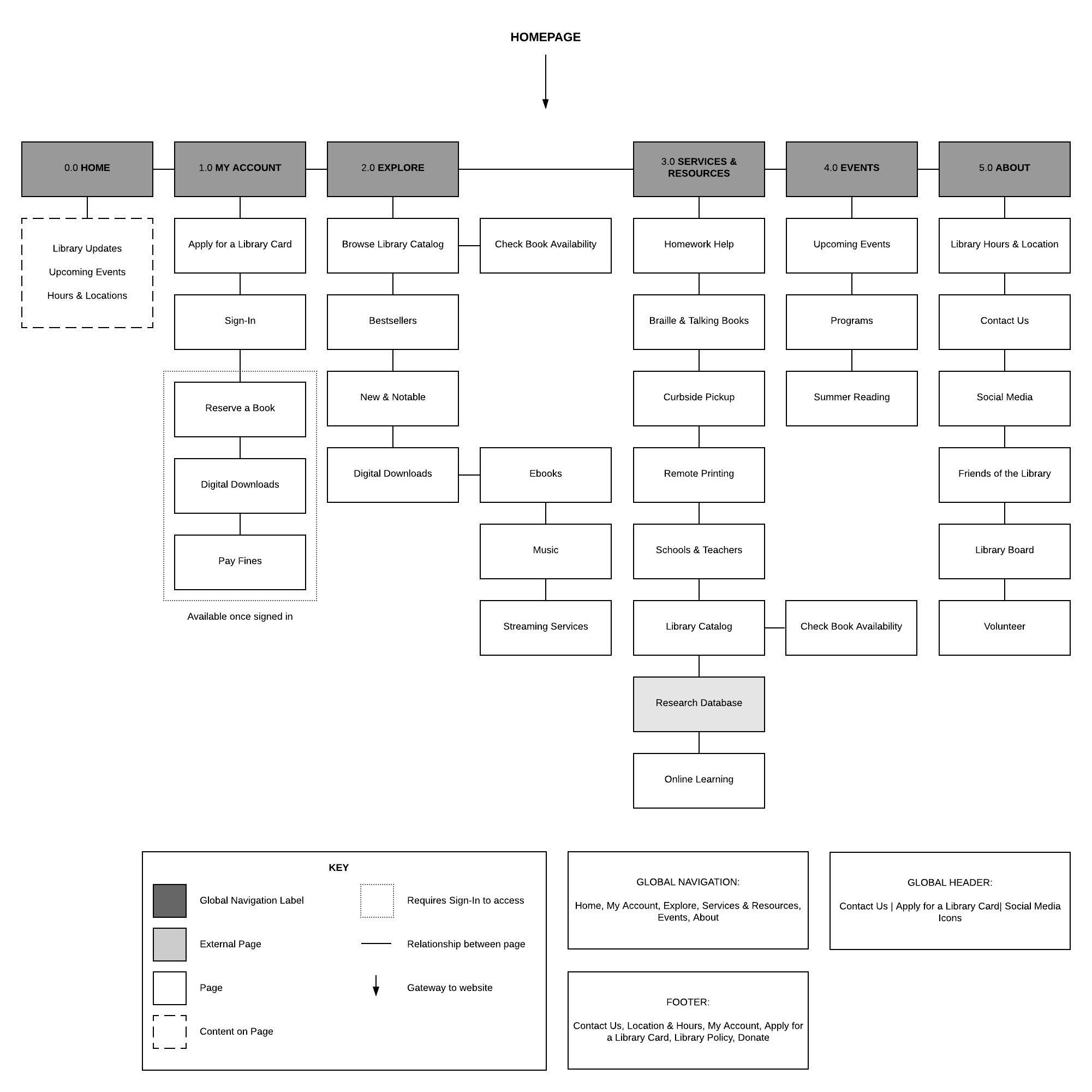
Working from the research and a full content inventory, I organized the site into six top-level categories:
Home
My Account
Explore
Services & Resources
Events
About
Each grouping reflects a mode a visitor is in rather than a department the library maintains internally. ”Explore" holds the browsing and discovery tasks (catalog, bestsellers, new and notable titles, digital downloads) while "Services & Resources" holds the practical, task-oriented ones (homework help, curbside pickup, remote printing, the research database). I deliberately let Check Book Availability live in both branches at once, connected by a direct relationship line on the map, because patrons arrive at that task two different ways: some are browsing and want to know if something's in, others are running a targeted search. Rather than force one "correct" path, I let the architecture follow both.
My Account required its own logic. Reserve a Book, Digital Downloads, and Pay Fines only make sense once a patron is signed in, so I nested them behind a "requires sign-in" boundary on the map rather than surfacing them as top-level items competing with tasks anyone can complete right away.
Search and the account-adjacent actions patrons need most, Contact Us, Apply for a Library Card, and social icons, were pulled out of the page-level hierarchy entirely and locked into the global header and footer, so they stay reachable no matter how deep a visitor navigates.
Wireframes & Workflows
I started low-fidelity, sketching a first set of wireframes and workflows in paper and pencil and running them through peer review before investing in anything more high-fidelity in digital. The homepage carried the weight of the most common tasks identified in research: Library Updates, Upcoming Events, and Hours & Location all living above the fold, with the global header keeping search, sign-in, and the library-card link visible no matter what a visitor scrolls past.
From there, I mapped out full click-through workflows for two highest-priority tasks, tracing each one from the homepage to its destination. Those workflows are:
Check for upcoming events
Check book availability
The first workflow follows a visitor from the homepage's Upcoming Events widget into the Events dropdown in the global nav, landing on a full events calendar with a breadcrumb trail back to Home, so a visitor exploring event listings never loses their place in the site.
A second workflow follows the Check Book Availability task from the homepage into the Services & Resources dropdown, through Library Catalog, and into a dedicated availability page with both a direct search field and a browse-by-category list, giving a patron two ways to complete the same task depending on whether they already know what they're looking for.
I moved these from paper into digital wireframes and tested them using Chalkmark, asking four participants to complete six tasks pulled directly from the task-prioritization chart built during research. Each task asked participants to locate specific information using only the proposed architecture, giving me a direct read on whether the new structure actually worked for the people it was built for.
The clearest finding to come out of testing was applying for a library card needed a more obvious home. It ranked as a high-priority task for patrons, but participants struggled to locate it within the proposed structure.
I addressed this by adding a dedicated link to the Apply for a Library Card page directly in the global header, positioned between Contact Us and the social media icons, keeping it visible in the one place every visitor already looks, regardless of what page they land on.

Outcome & Impact
The final information architecture replaced a structure built around how the library organizes itself with one built around how patrons actually think and search.
The final deliverables are grounded in real interviews, supported by published research, and validated with real users before a single page of the redesigned site went live.
Details in the final wireframes carry that thinking through. Check Book Availability sits in two branches instead of one. The sign-in boundary keeps account tasks out of a first-time visitor's way, and strong wayfinding signifiers and affordances sit visibly on every page, so no one loses track of how they got there or where to go next.


